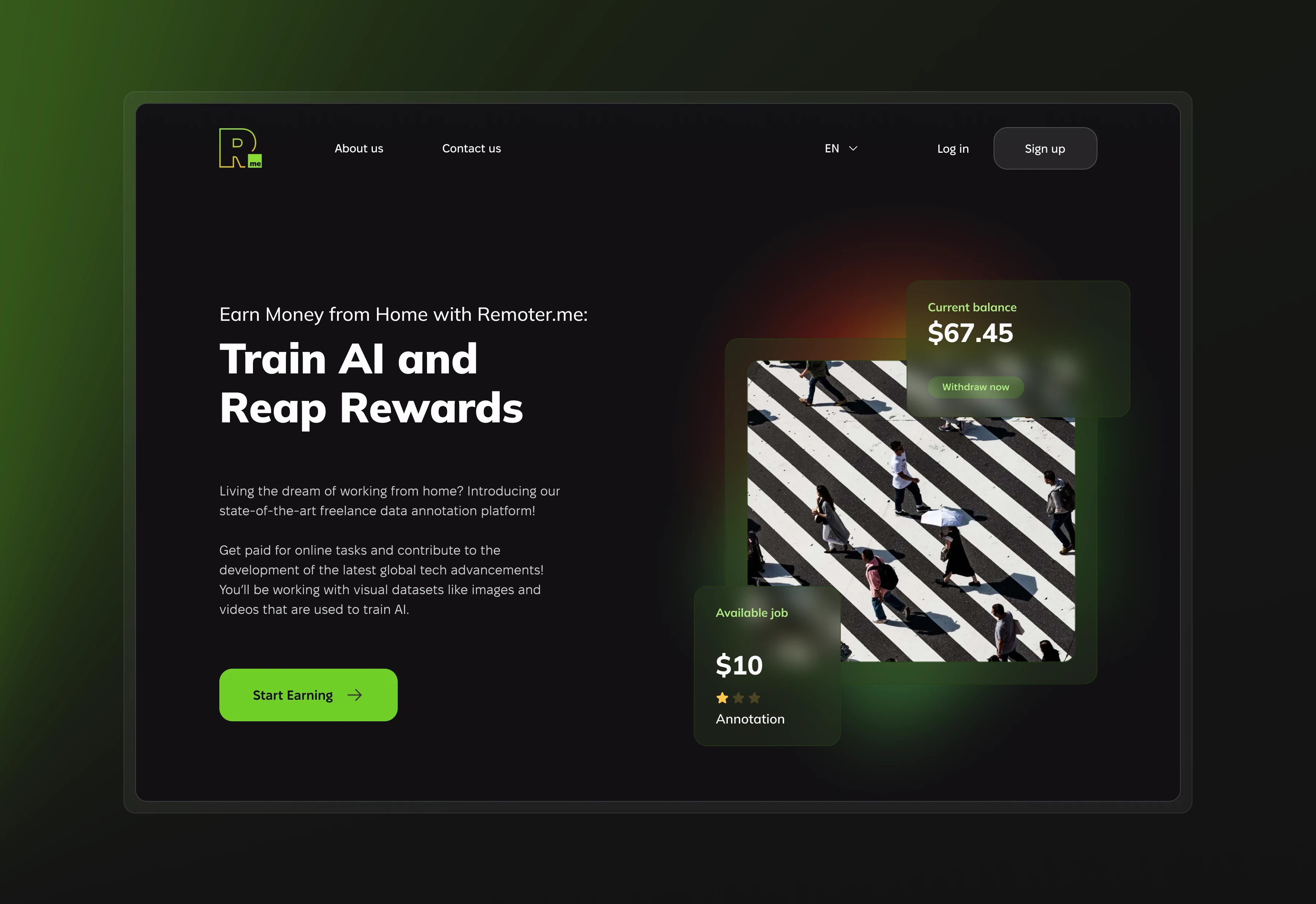
Remoter.me · 2023
Designing the public face of a remote work platform — starting from a single logo and building a visual language that extended well beyond the page.
Remoter.me had a logo. Everything else — type, color system, spacing, component patterns, visual tone — needed to be built from scratch. The brief was a landing page, but a landing page is also a brand statement. Whatever got designed here would set the visual direction for everything that followed.
The challenge wasn’t just making a page. It was building a design language that could hold up at scale, using one existing mark as the only starting point.
I worked outward from the logo — reading its weight, geometry, and implied personality, then extending those signals into a full visual system. Typeface and color choices had to feel native to the mark. Spacing and component patterns had to be systematic enough to replicate without redesigning from scratch each time.
The visual direction went dark — a deliberate move away from the lightweight pastels that dominated productivity tools at the time. It made product screenshots feel considered rather than generic, and gave the brand a distinct presence in a crowded category.
Components were built as a reusable system rather than one-off page elements. When new pages and social media templates were needed later, the visual language was already there.
A landing page that became a design system. The visual language built around the original logo extended directly into new website pages, social media assets, and marketing materials — without starting from scratch each time. New assets were produced directly from existing components, which cut production time for everything that followed.
The brief was one page. The deliverable was a foundation.
Work created for SupportYourApp, Inc. All rights reserved by SupportYourApp, Inc. Shared here for portfolio purposes.